Wednesday, May 4, 2011

Snow is hardly ever white

My first painting in two years! 
I was in Zürich for Christmas last year.  The Wildbach is a stream near the Zürichhorn area.  It means 'wild stream' in German.


Wildbach in December
50x70 cm, oil on stretched canvas

A landscape with snow provides wonderful contrasts for a painting.  The cool shadows vs. warm sunlight, light snow vs. dark trees.  It could be monochromatic and focus on values and shapes.  Or it could be a study on the various hues (shades of colours) which exist in the scene.  The colourless snow is never truly 'white'.  It reflects the subtle colours near it, which are further affected by the sunlight (or lack of it). 

Saturday, August 1, 2009

Monday, June 29, 2009

Wednesday, May 20, 2009

See Siang

I did this sketch for my friend See Siang's 30th birthday.

Ink sketches are easier and quicker to do than oil paintings. Yet a well-done ink sketch can still effectively capture a person's mood and personality.


See Siang
8x10 inches, ink on paper

Tuesday, October 14, 2008

B&W


This was commissioned as a birthday gift for Dato' Faridah Merican. It was based on a photo of her and her husband Joe Hasham.

This was my first 'black & white' painting. In order to avoid making the figures appear too cold or ghostly (adding white 'cools' down the colors), I mixed extra yellow to the highlights.

Joe & Faridah
12x16 inches, oil on canvas board

Sunday, May 25, 2008

Drawing the viewer in


Sometimes you would come across a painting and spend a long time in front of it, yet you're not quite sure why you're more attracted to that painting than the piece next to it. This is probably because the painting has a good composition that captures the viewer's attention.

When an artist starts a painting, he would create a composition that would guide the viewer into the painting and keeps his or her attention for as long as possible. In this painting of my friend Ed, the Western viewer usually starts looking from the left (like in reading). The viewer would start from Ed's right elbow, up his shoulder and to his face (the point of interest of any figurative painting). Next, the dark and strong-shaped shadow on the closet door takes the viewer to Ed's left hand, then down on to his left torso side, along the briefs to the right hand on his hip, then back again to the right elbow. The strong contrasts in color values and edges guide the viewer, without him realizing it. The journey in elliptical motion begins again, but during the second time around the viewer would notice other secondary features, such as Ed's reflection in the mirror.

In my opinion, the mark of a successful painting is that it manages to capture the viewers' attention for a long period of time.
Nothing to wear
16 x 20 inches, oil on canvas board

Thursday, May 22, 2008

Cool vs. warm colors


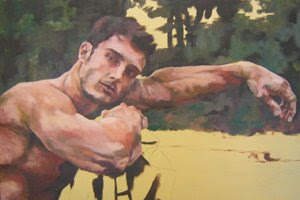
The human skin is mostly warm red/yellow, but to avoid it from being too 'hot' you would usually put dabs of cool color, usually green in the shadow and facial hair areas, and veins. The background earth in this painting is also warm with some cool colors. Meanwhile, the background trees and foliage is mostly cool green, but with accents of warm brown, indicating tree trunks. So there is a little bit of green in the dominant red/yellow area, while there is a little bit of red in the dominant green/blue area. The two dominant areas complement each other and create unity in the overall painting. Also, the sky echoes the cool color of the towel.

Sergei
24 x 36 inches, oil on stretched canvas